Imagine that you can buy all your favorite health products in just one location! As one of the many online shops that exist, Kenkō offers this service with less hassle and more satisfaction for their customers.


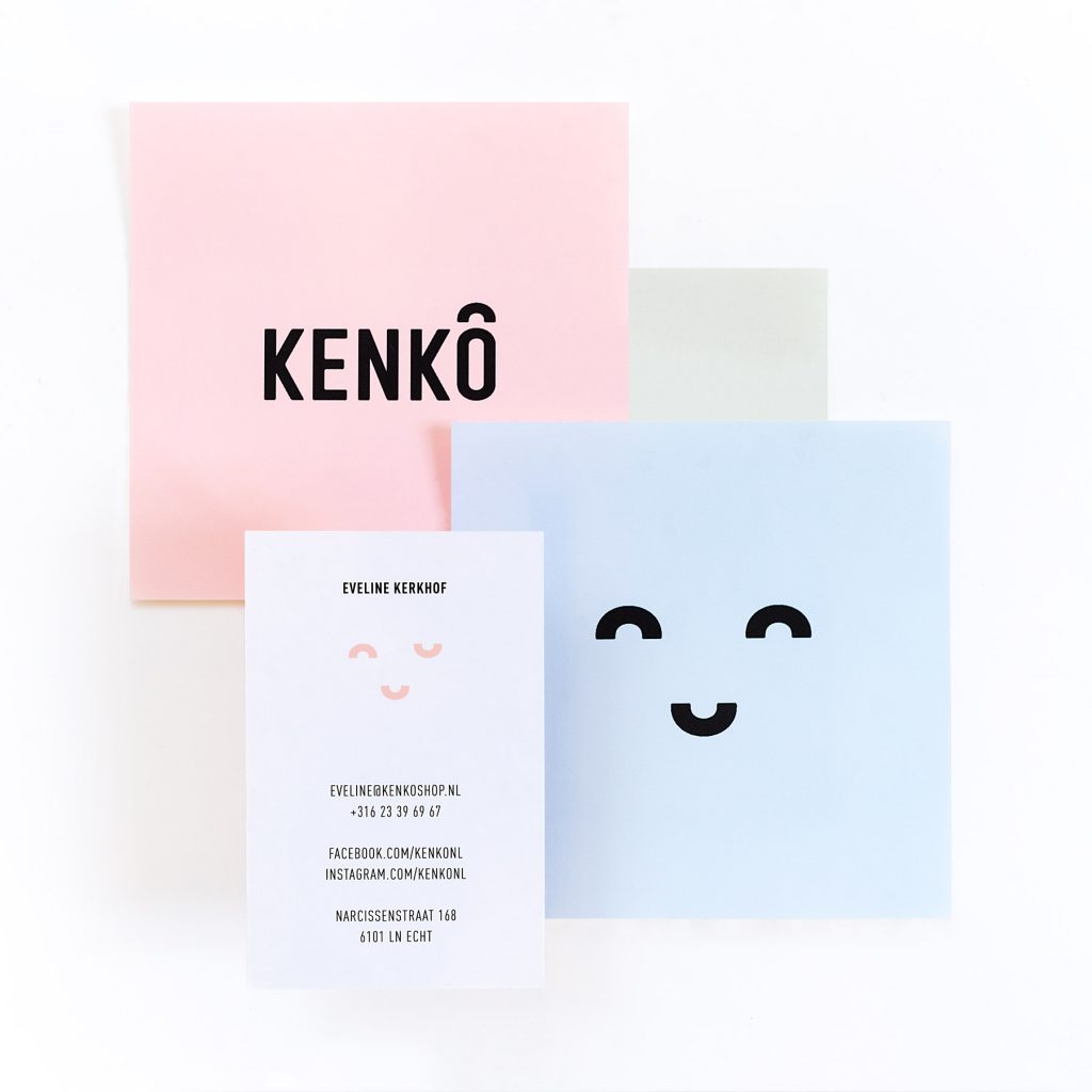
We have designed the complete visual identity that makes Kenkō what it is and what the brand stands for since 2016. By simply emphasizing that Kenkō means ‘healthy’ in Japanese, we have created a positive and refreshing identity.
As an extra touch, we accentuated the distinctive stripe on the ‘O’. We turned it into a wave derived from the famous ‘Japanese Seigaiha wave’. We let the wave shine through in our patterns. Among other things, we turned it into a cheerful Japanese face.

