Op ‘t Root Hoveniers was founded by Rik op ‘t Root in 2017 and since then has grown into a company with a large team of skilled gardeners, each with their own specialty ranging from construction to maintenance in both the private and the business sector.
This development asked for a matching image. Therefore, Op ‘t Root Hoveniers approached C FOR CHARLIE.
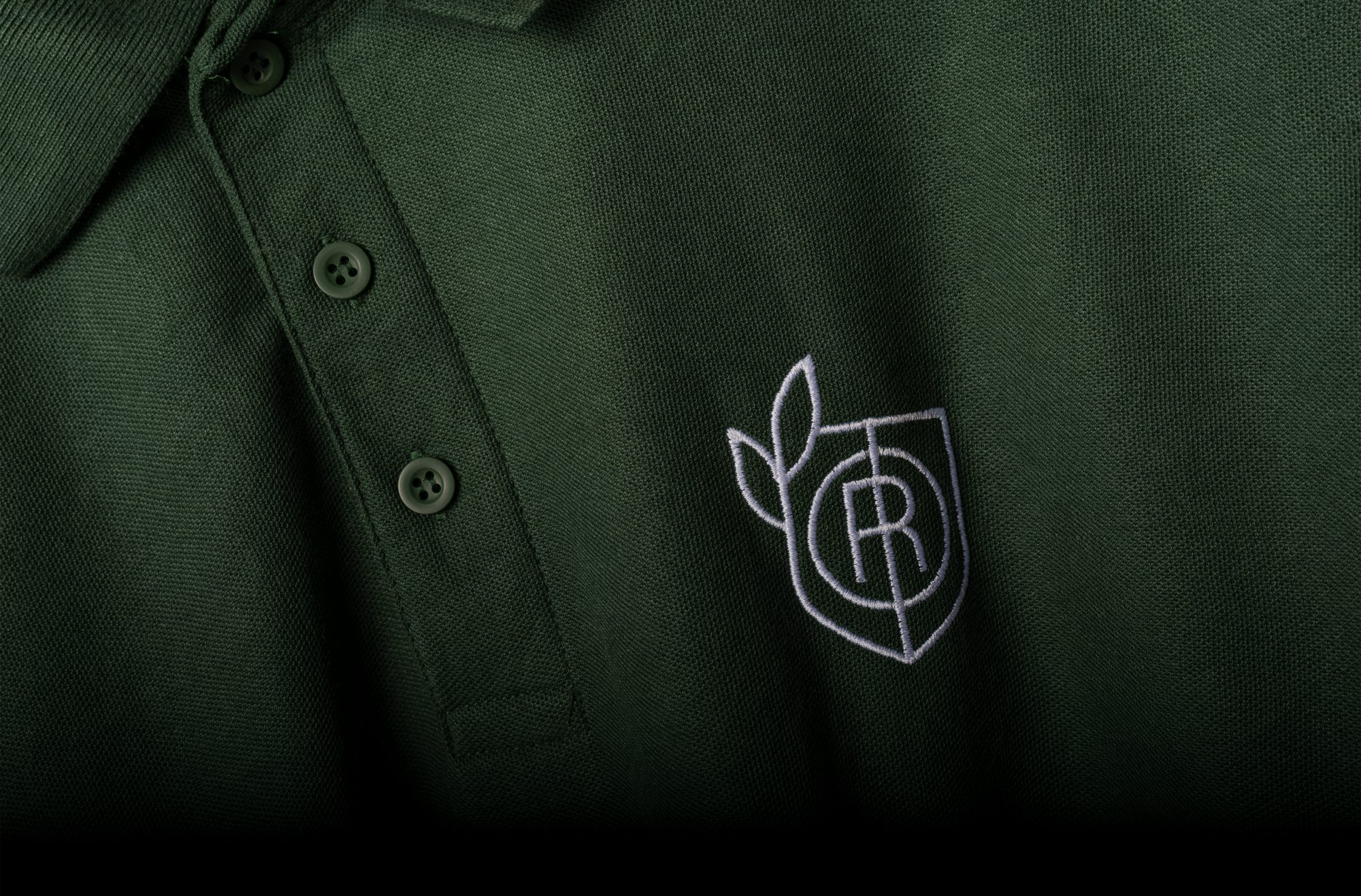
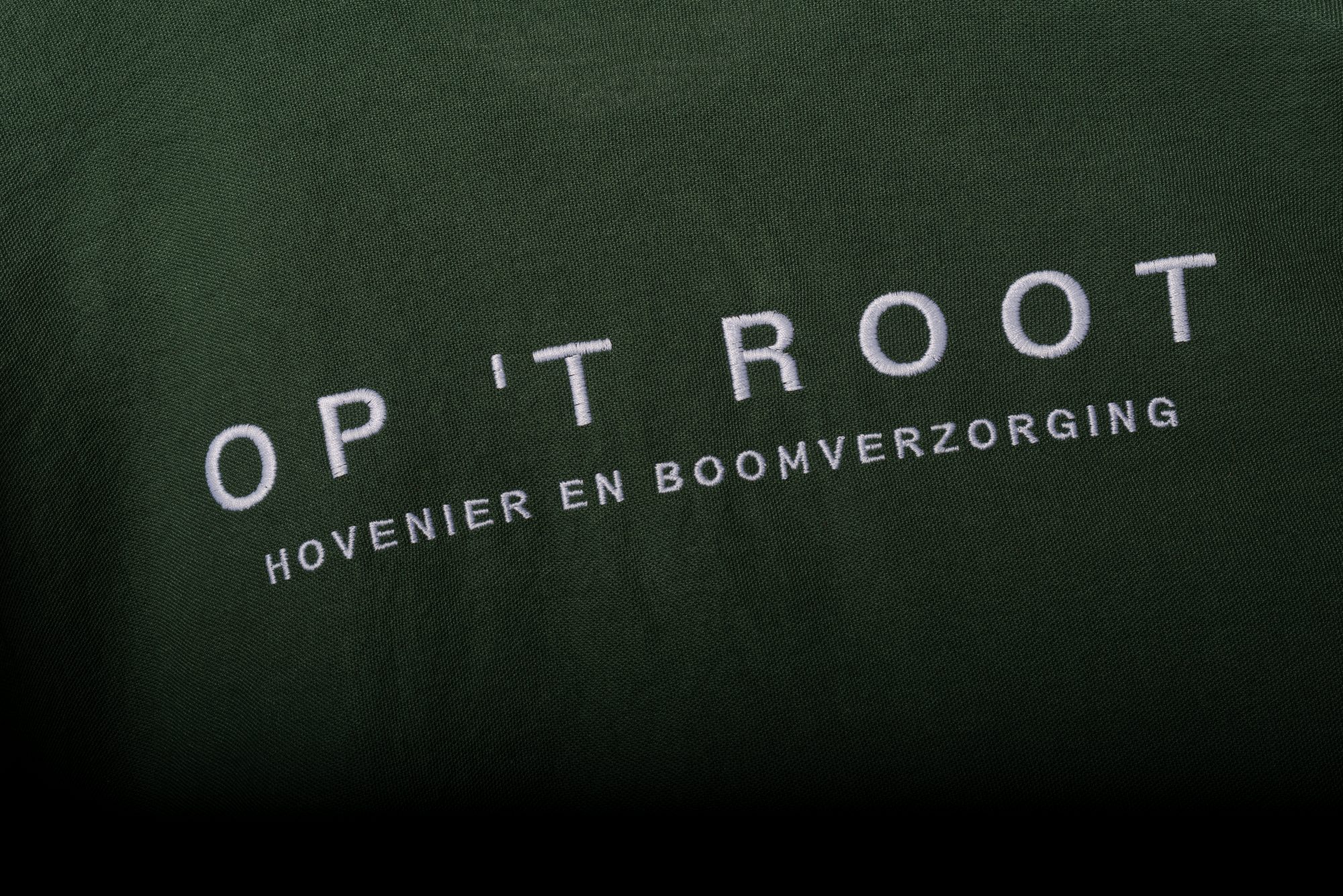
We have all seen them: the obvious trees, landscapes, shovels or wheelbarrows that can be found in every horticultural logo. We wanted to take a different approach. After all, we build unique and well-considered brands. In developing the logo, we approached gardening as a craft. In accordance, we developed a stylish coat of arms in which with a little searching you can find the initials of the company name: O, T and R. In order to still slightly emphasize their work with plants, we have added two subtle leaves to the shield. Matching this, we developed the typography for the name mark ourselves, with a tight interplay of lines and thickness matching the lines in the coat of arms.
As with all logos that we design, we also took into account the usability of this logo. This way the logo can be spread over many different articles. From a large embroidered logo on workwear to a small engraved logo on a shovel, always usable and never unclear or illegible.
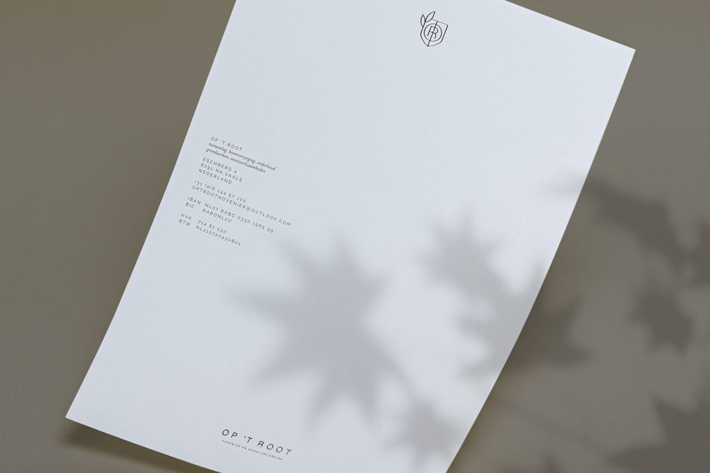
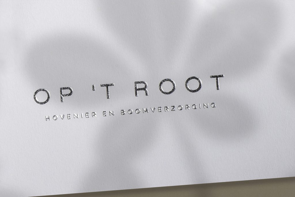

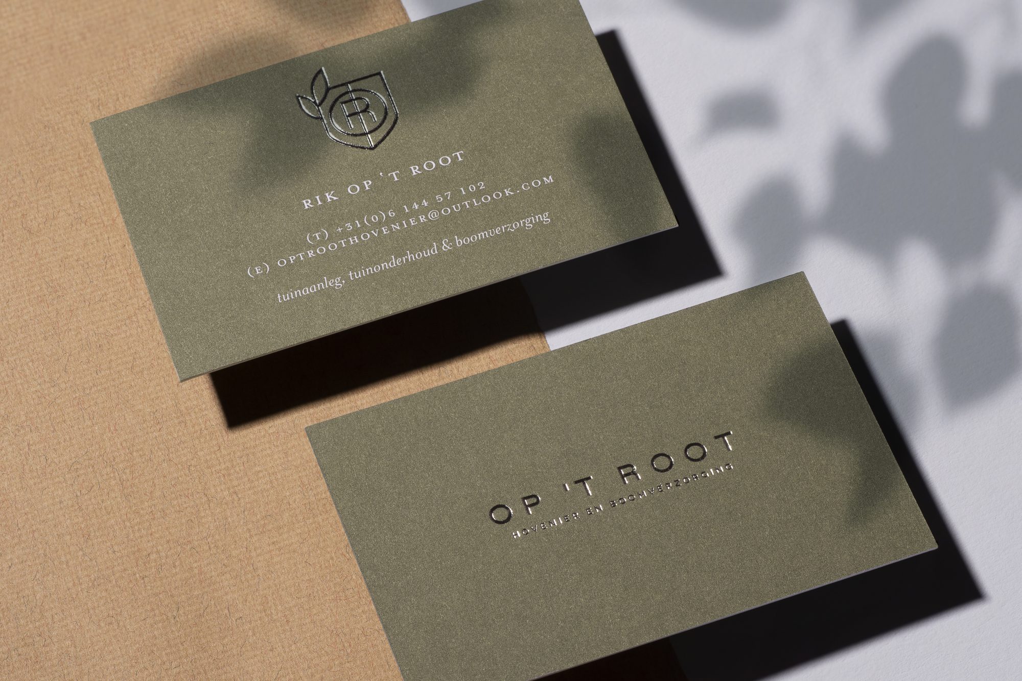
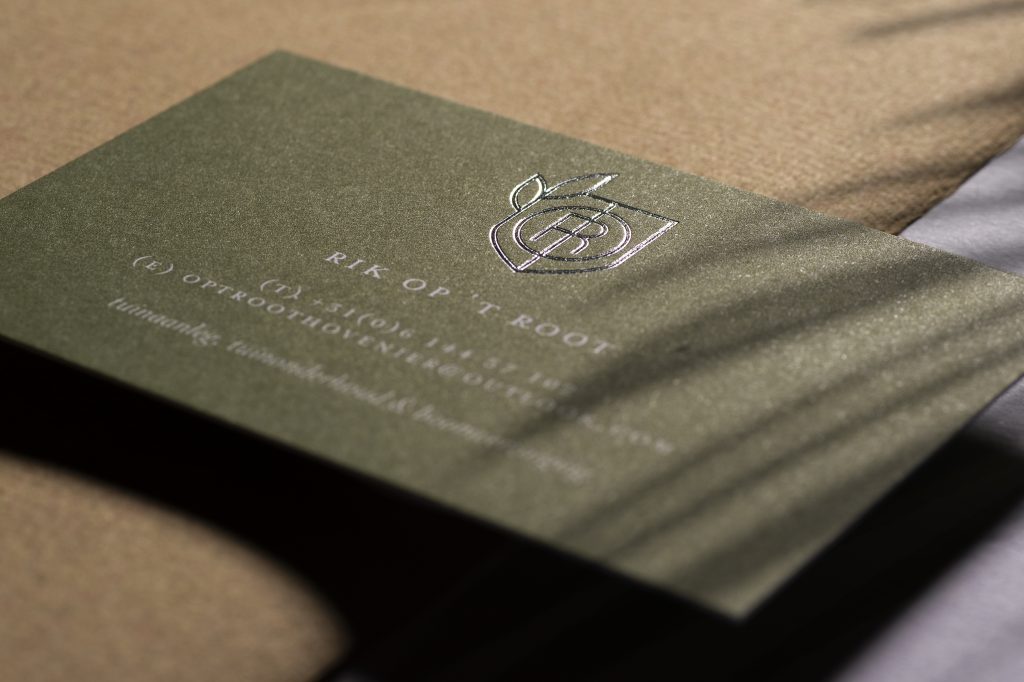
For all printed materials we have opted for silver foil printing in combination with clear white textured paper for invoices and quotations and heavy colored army green paper for the business cards. This emphasizes the company’s class once again and also distinguishes it from the competition.
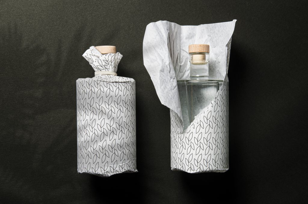
Finally, we assisted with embroidered company clothing and a simple but sophisticated packaging concept for business gifts. A thin blotting paper with a pattern design of the two leaves of the coat of arms. Symbolically, a bottle of water for watering new plants or a bottle of wine for Christmas can be wrapped in style.
