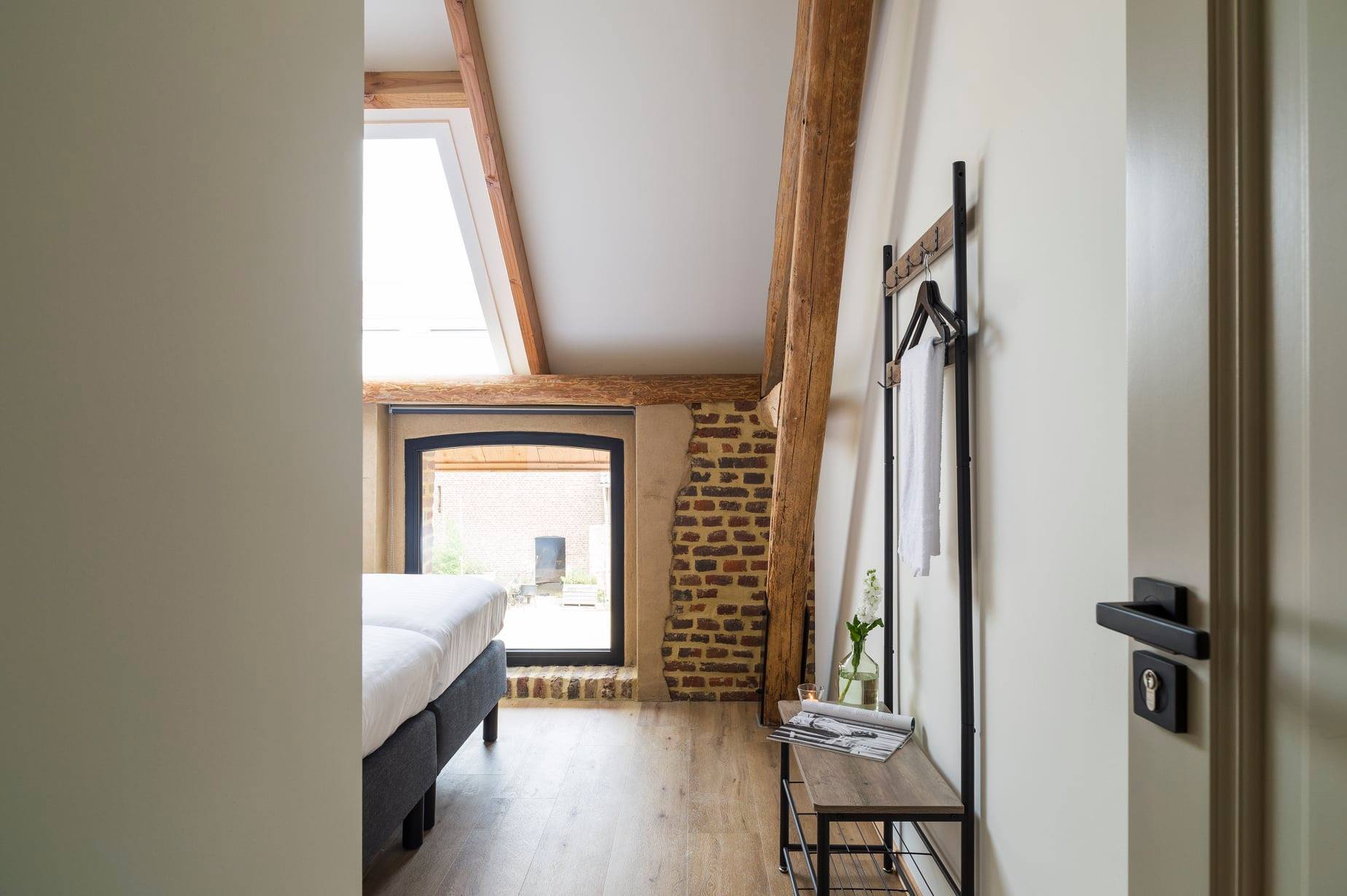
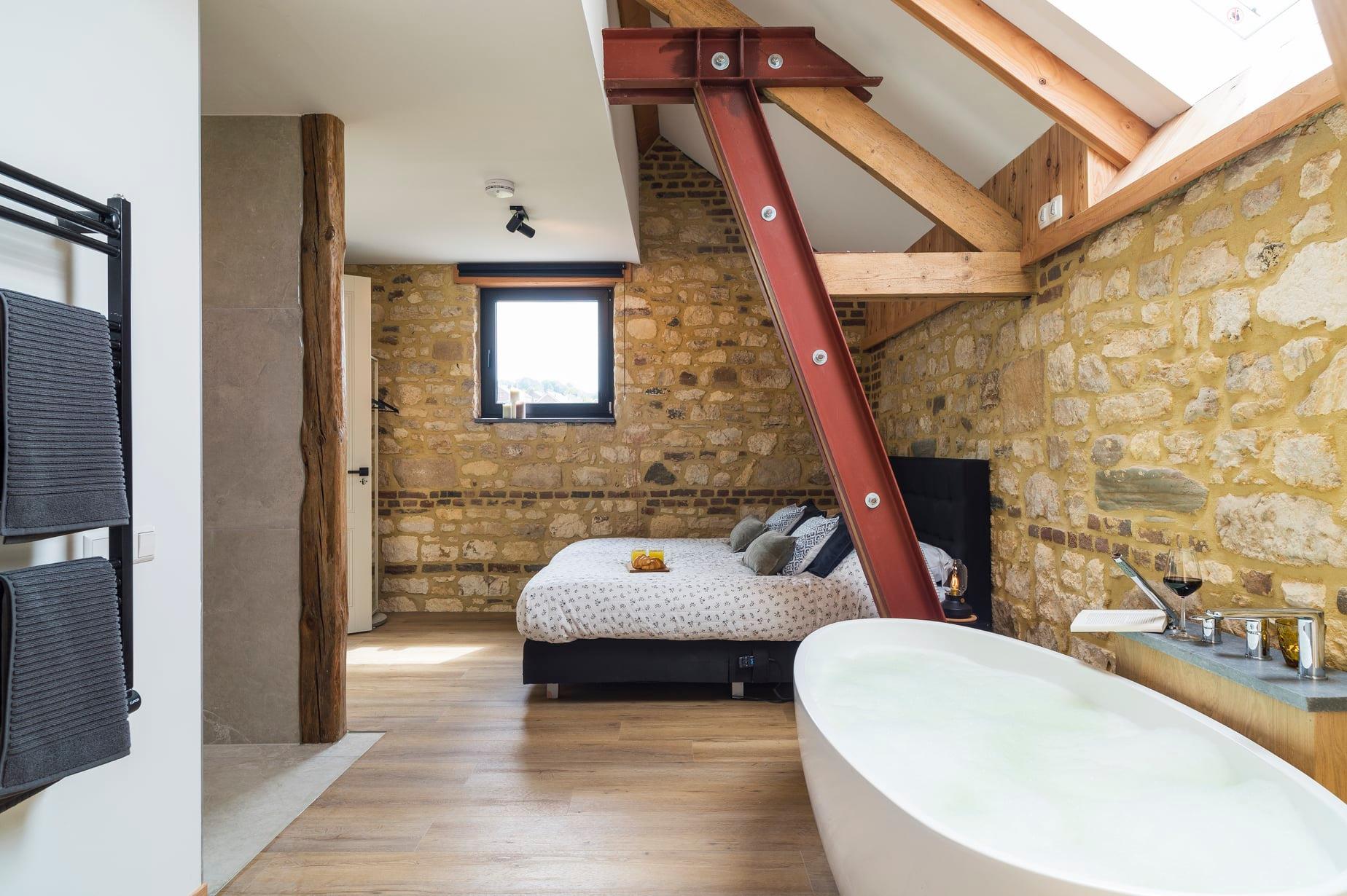
South Limburg, also known as the Heuvelland, is a piece of paradise in the Netherlands. It is made up of a fairytale landscape filled with ancient river terraces, steep slopes, small villages and hamlets, orchards and characteristic farmhouses such as Carré 1711. The farmhouse, which covers a total of 5.5 hectares with its surrounding pastures, has served as a farm for many years. Carré 1711’s origins can be found centuries ago, all the way back to 1711. It is a remarkable piece of Limburg that holds a lot of cultural-historical value, and which has been restored to its former glory after a thorough renovation.
The carefully renovated Carré 1711 offers the perfect blend of Burgundian enjoyment and relaxation. The farmhouse offers the ideal accommodation for team training, staff outings and family or friends weekends. The authentic appearance, modern luxury and natural location will ensure an unforgettable stay.
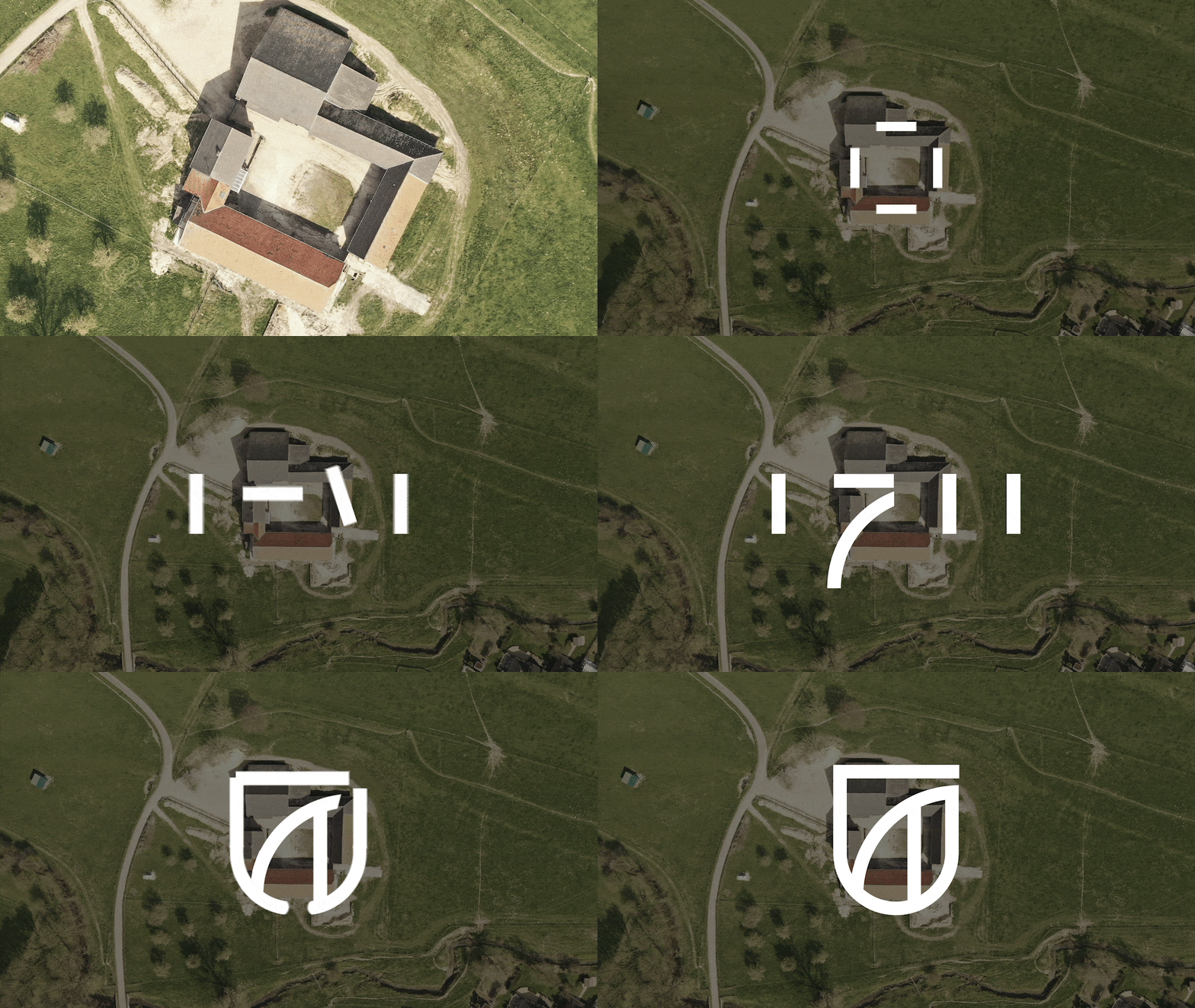
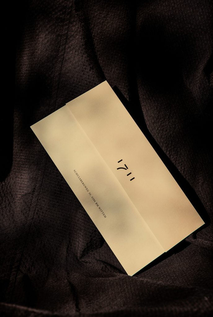
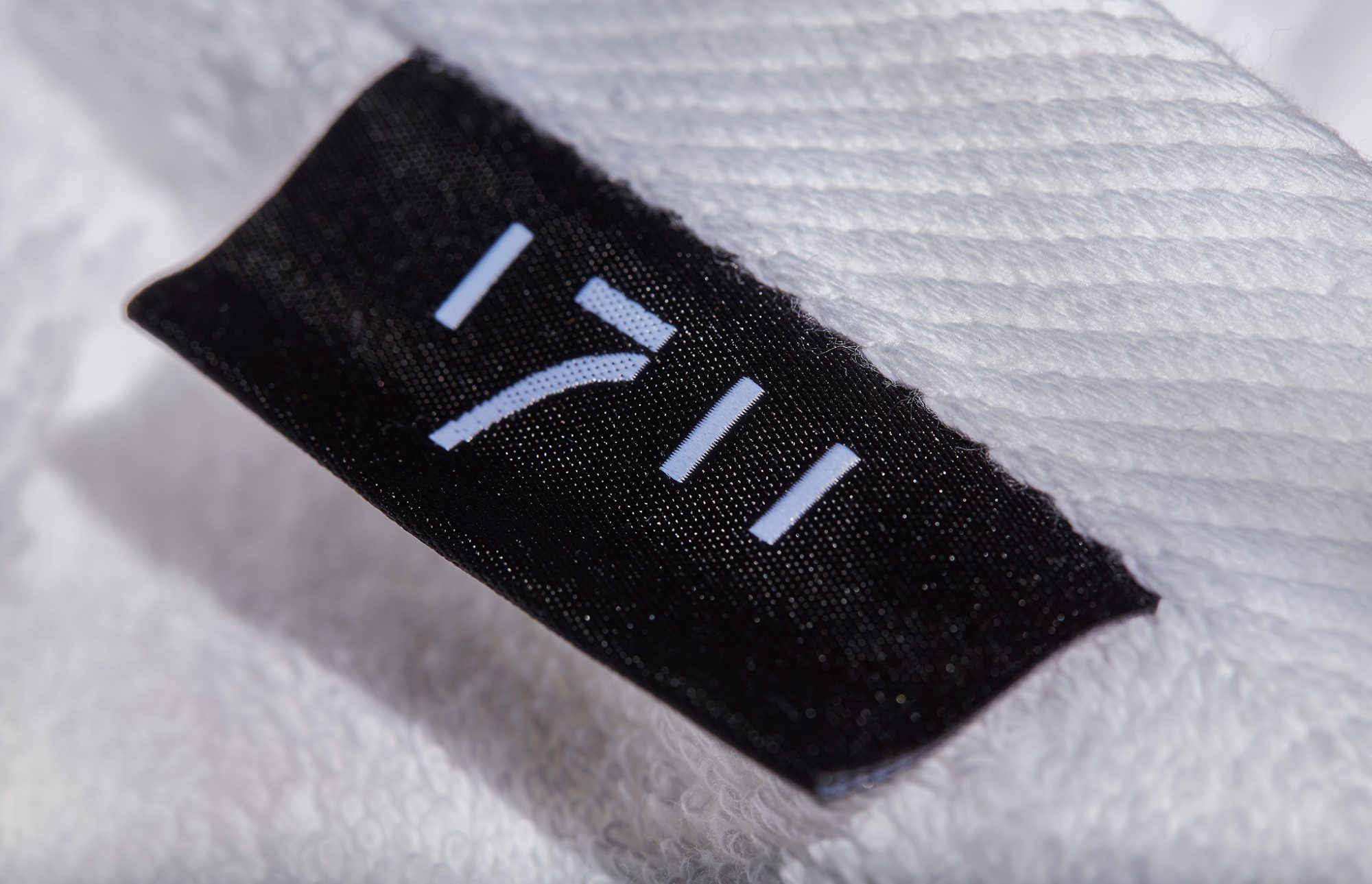
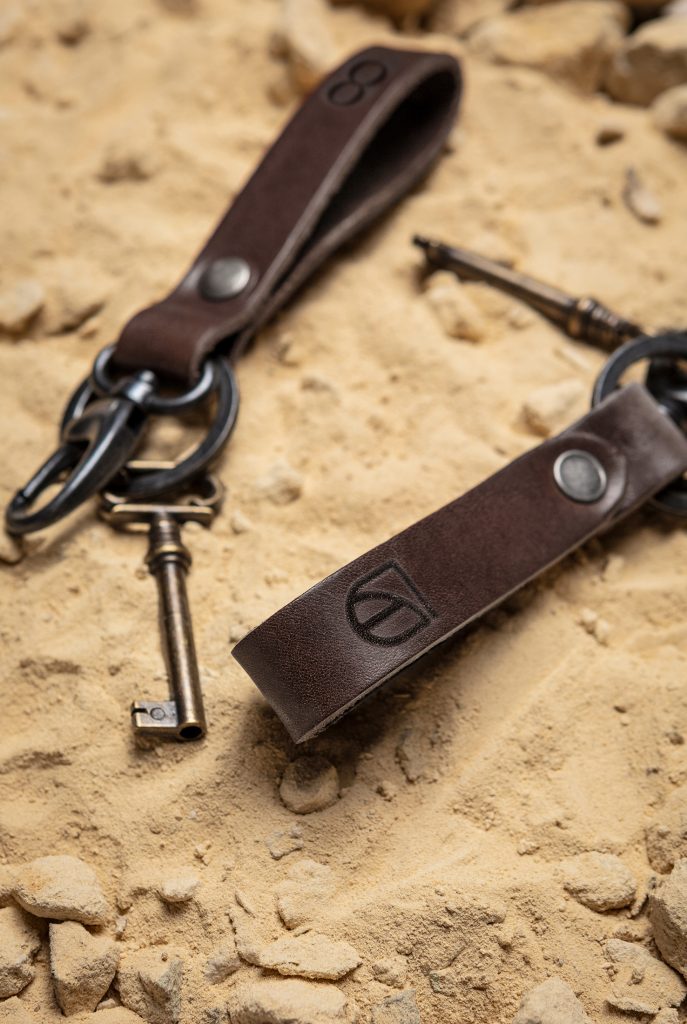
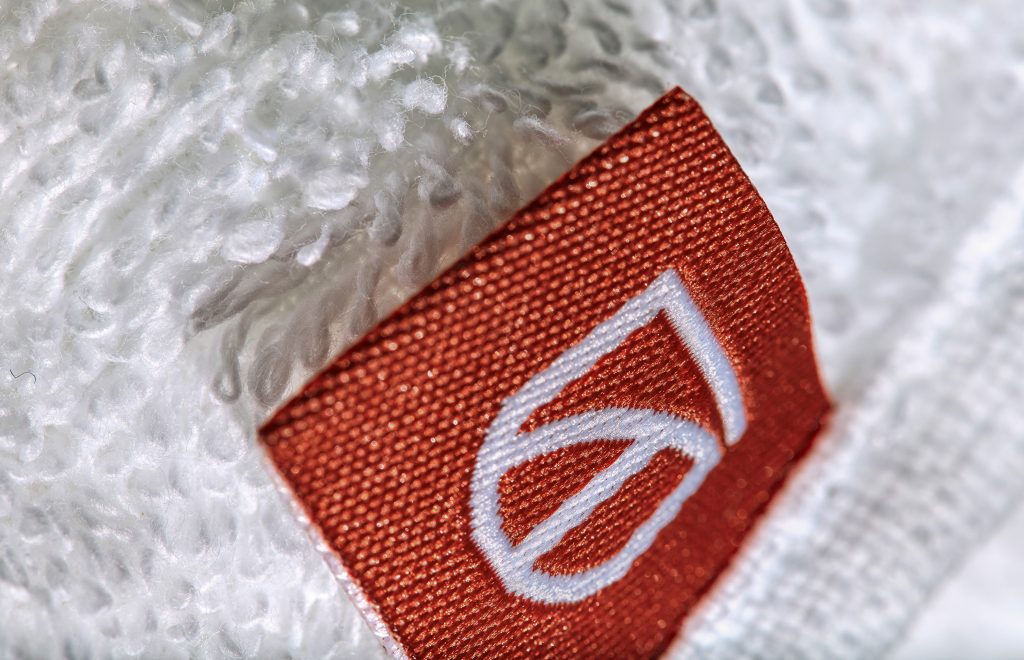
C FOR CHARLIE had the honour of adding a graphic touch to this beautiful location. We took our inspiration from the origins and characteristics of the Square Farm. Not just something pretty, but a corporate identity that tells the story of an authentic historical location. The logo was based on the shapes of the Carré. The four rectangles symbolize the four wings of the square farm and the little arch is a link to the architectural style of vaults in old barns and arches in windows and gates.
The logo represents a coat of arms, a statement appropriate to the rich history of the farmhouse. The arms are made up of the three ones and the seven of the logo, creating a beautiful entity.
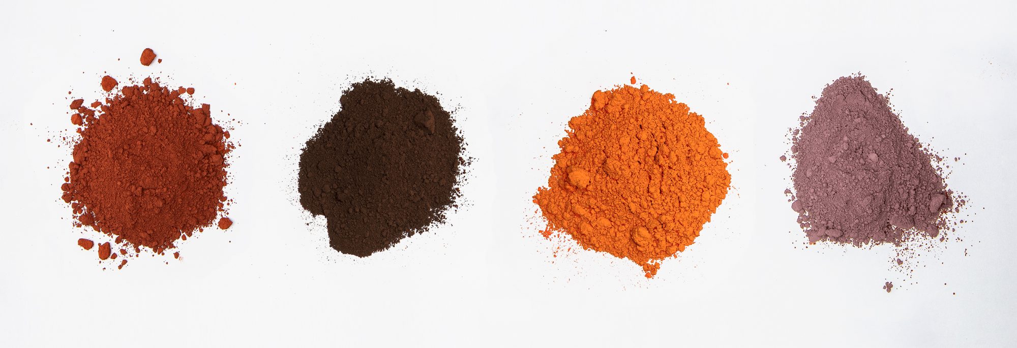
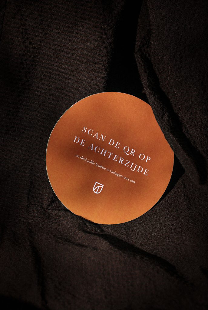
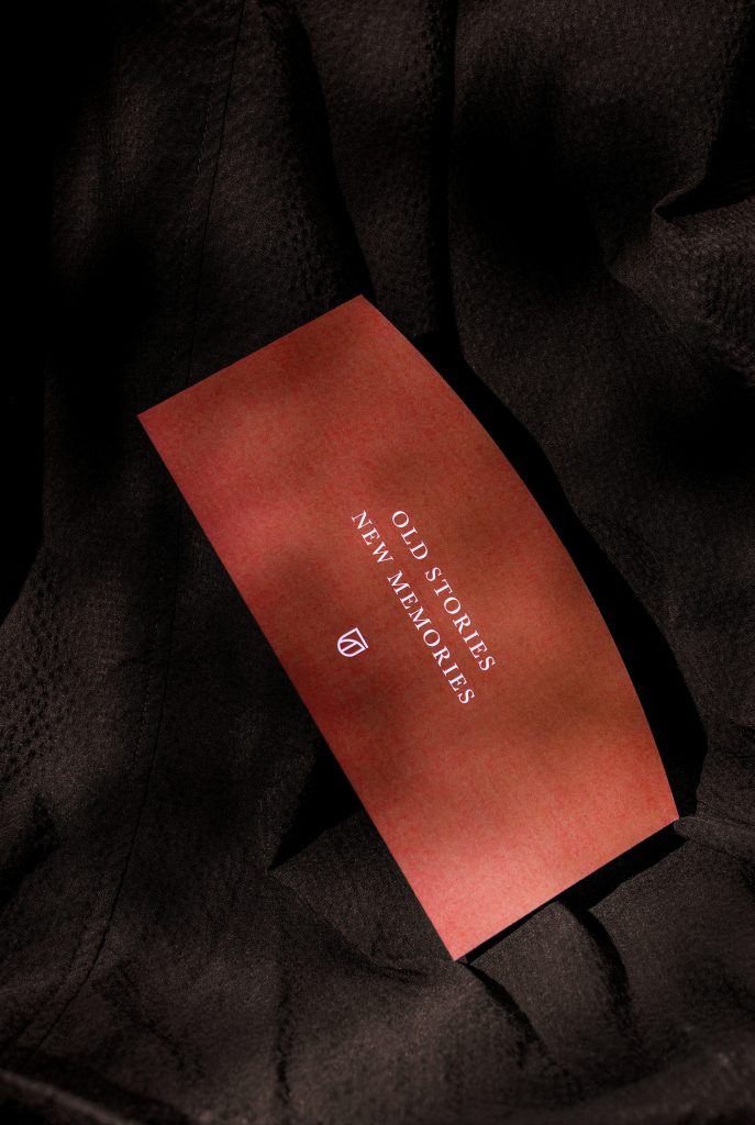
For the colours, we looked into history books, because nothing suits a building from 1711 better than 18th-century pigments. The colour Red Ochre as the basic colour with Cologne Earth, Leadmenie and Apple Blossom as supporting colours matched the history of the farm best. Together with the pale yellow colour of limestone, that characterises South Limburg and lines the walls inside the Carré farmhouse, a beautiful whole is formed.
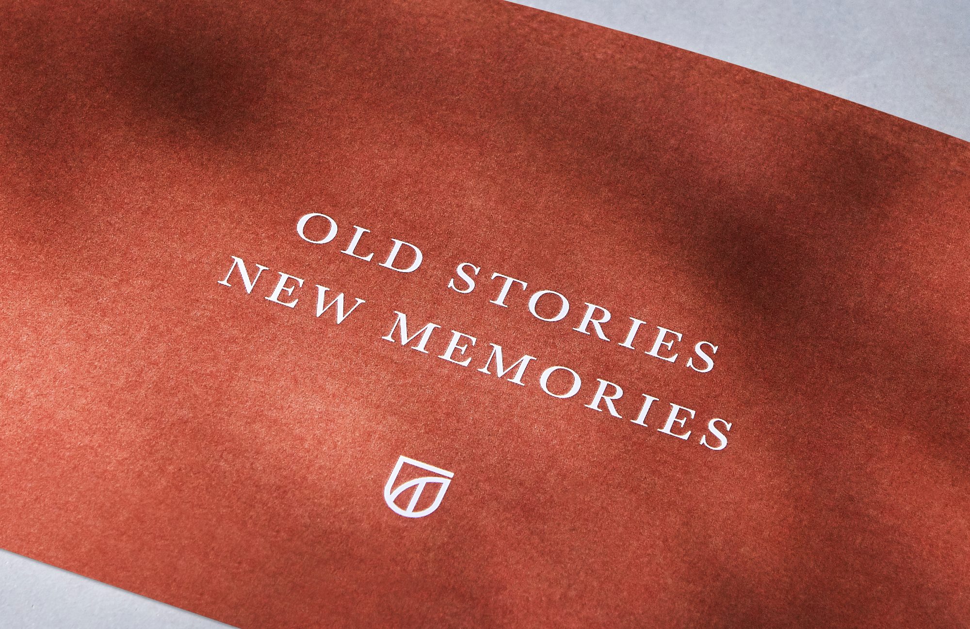
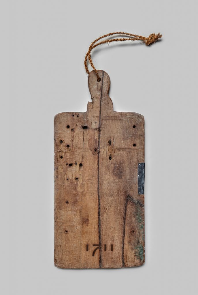
Even the typography is not a coincidence. It consists of a well-known serif font that originated in the 18th century. The exceptional shapes of the printing inspired by various vaults, window frames and gateways within the farmhouse complete the circle.
